

What the clamp()? Mastering the CSS clamp() Function
Responsive development is a lot like a puzzle, where each piece must fit perfectly, regardless of the size of the board. As a developer, I am constantly seeking tools and functions that make this puzzle easier to solve. The CSS clamp() function is one such tool, offering a dynamic solution to responsive design challenges. To make it even easier to harness the power of clamp(), I’ve developed a clamp() calculator tool that demystifies the process of finding the perfect values for your project.
Understanding the CSS clamp() Function
At its core, clamp() allows CSS values to dynamically adjust between a specified minimum and maximum, based on the viewport. This function is elegantly simple in syntax but profound in impact:
clamp(MIN, VAL, MAX)MIN: The minimum value the property can take.VAL: The preferred value, which adjusts within the boundaries of MIN and MAX. (This is the magic number, more on it later.)MAX: The maximum allowable value.
This functionality makes clamp() a versatile ally in creating responsive designs that scale seamlessly across devices.
When is clamp() used in CSS?
clamp() shines in scenarios where adaptability is key. Here are a few examples:
- Font Sizing:
font-size: clamp(1rem, 2.5vw, 2rem);ensures text remains legible and proportionate across devices. - Responsive Layouts:
width: clamp(250px, 50%, 1200px);allows containers to grow with the screen, yet remain bounded by sensible limits.
These use cases highlight clamp()‘s role in achieving fluid, adaptable designs with minimal effort.
Deciphering the Preferred Value for CSS clamp()
When I first dabbled with the CSS clamp() function, I found myself puzzled over one critical question: “How do I accurately determine the preferred value?” The guidance provided in clamp() documentation felt somewhat elusive, and the examples I encountered often resorted to seemingly arbitrary viewport width (VW) values for this purpose.
Here’s a breakdown of strategies to pinpoint the ideal preferred value.
Opting for a Static VW Value
The most straightforward method is to select a static VW value. While this approach may lack finesse, it’s undeniably simple and gets the job done. However, it does involve a bit of trial and error to land on the most suitable unit.
Leveraging a Calculator to Find the Ideal Clamp() Preferred Value
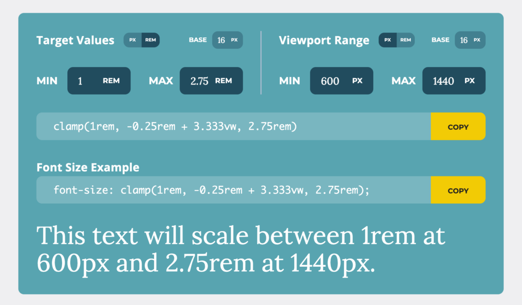
For those seeking precision without the guesswork, I recommend using my online clamp() calculator. This tool is designed to effortlessly bridge the gap between your desired MIN and MAX values across a specified screen size range. By inputting these parameters, the calculator devises a VW value that seamlessly transitions between your MIN and MAX settings within the chosen viewport dimensions.
This method not only simplifies the process but ensures your preferred value is anything but arbitrary, providing a tailored fit for your responsive design needs.
Calculate The Preferred Value Manually
Creating a responsive design with perfectly adjusted sizes involves calculating a precise preferred value for the CSS clamp() function. This calculation hinges on understanding the linear relationship between element size and viewport width, represented by a slope and a y-axis intersection. Here’s a step-by-step guide to determining these critical values and crafting your clamp() function:
Preliminary Assumptions
For these calculations, we’ll define the following values. For the sake of this function, we will assume that all units are in REM.
mVas the minimum value (in REM)MVas the maximum value (in REM)vminas the minimum viewport width (in REM)vmaxas the maximum viewport width (in REM)
Step 1: Calculate the Slope
The slope (S) illustrates how the element size scales relative to changes in viewport width. It’s determined by connecting two points: (vmin, mV) and (vmax, MV). The formula to calculate the slope is:
S = \frac {MV-mV} {vmax-vmin}This formula yields the rate at which the size should increase or decrease as the viewport width changes.
Step 2: Calculate the Y-axis Intersection
The y-axis intersection (B) indicates where the line representing our scaling factor intersects the y-axis. This value is crucial for calculating the dynamic portion of our clamp() function. It’s computed as follows:
B=−vmin⋅S+mV
This calculation gives us the starting point of our size scaling on the y-axis.
Finalizing Your clamp() Function
With the slope (S) and y-axis intersection (B) determined, you can now formulate the preferred value for the clamp() function. The syntax for the function, incorporating these values, is:
clamp(\textcolor{#58a4b0}{mV}rem,(\textcolor{#58a4b0}{B}rem+(\textcolor{#58a4b0}{S}⋅100)vw),\textcolor{#58a4b0}{MV}rem)In this final expression:
- The first value sets the minimum size,
- The middle value dynamically adjusts the size based on the viewport width, incorporating our calculated slope and intersection,
- The last value caps the size at a maximum.
By following these steps, you ensure your clamp() function dynamically adjusts element sizes with precision, maintaining design integrity across different screen sizes.
The CSS clamp() function is a game-changer for responsive styles, ensuring elements adapt smoothly across devices with less code. While finding the perfect preferred value might seem complex, my clamp() calculator tool makes it straightforward, guiding you to the ideal settings with ease. Ready to simplify your responsive design process?